LADWP
Rebrand proposal pitch for the Los Angeles Dept. of Water and Power aimed at reconnecting with a city it's been developing since 1902. The design consists of adaptive elements that represent the city it powers and people in it.

The original LADWP brand had a heavy serif that made it feel regal and representative of a city utility. Preserving the history of the brand and what it has accomplished was important. The heavy slab-serif type conveys a sense of professionalism and a feeling worthy of a government entity. In contrast, the friendly curves keep it conversational and fresh.

Utilities often overlook the on relationship they have with their customers. Because of zoning, the customer generally doesn’t get a choice in who they go with. Eventually, the customer interaction is entirely transactional and the user forgets about the service they’re providing.
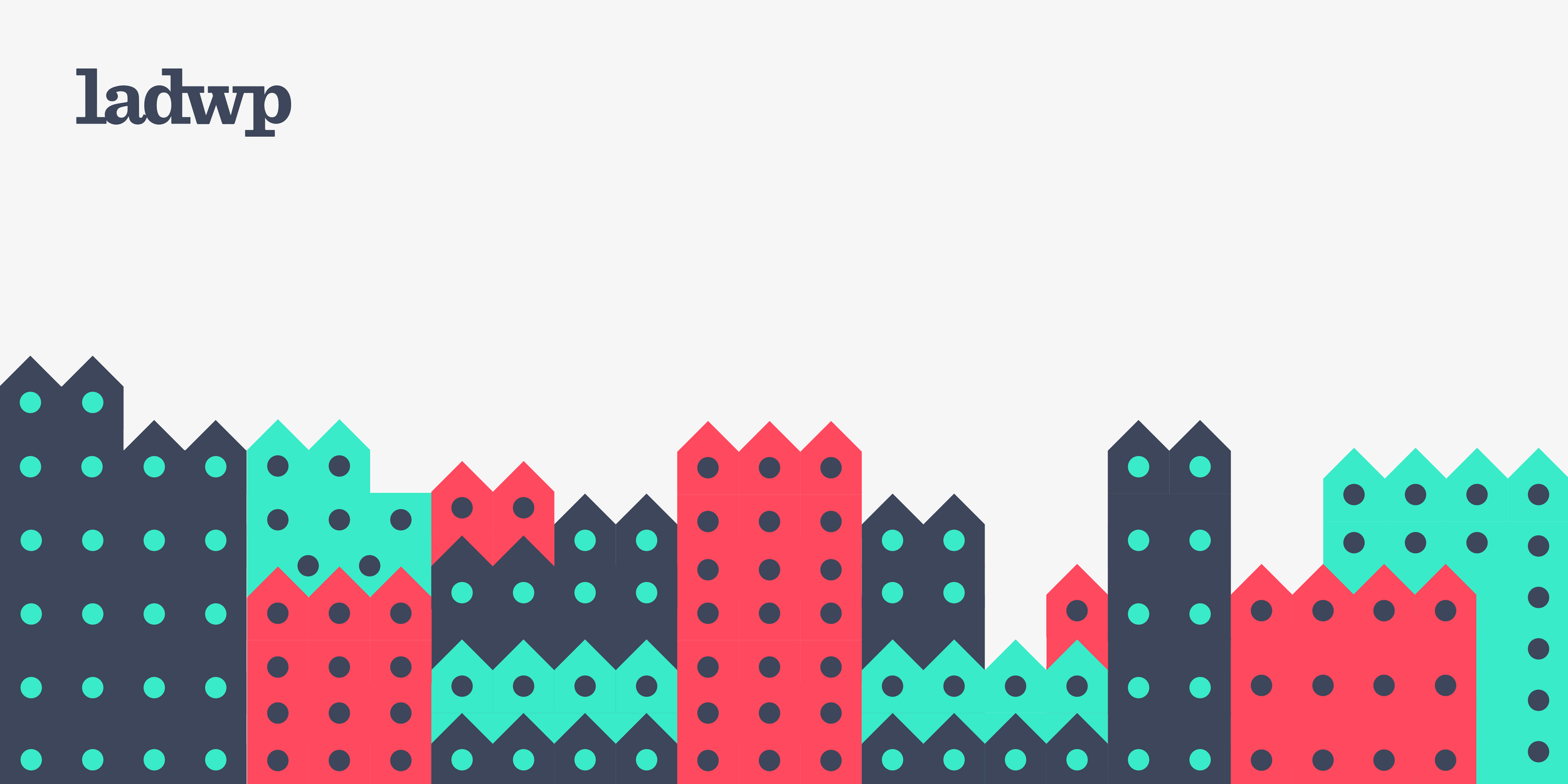
This design was aimed at bringing the utility giant back into the conversation, only this time as a part of the community. I wanted to convey a sense of community and inclusion that the city could relate to and feel represented by. The identity system not only shows people and houses, but geometrically fits together as a seamless pattern with meaning.
The rebrand relied on heavy marketing around their contributions to the city and making citizens aware of city restoration efforts and outreach. This would bring light to all the ways the utility is more than just a utility, and in the end, more than just a bill to pay.


Throughout the project the theme we kept a common theme of energy and power. The bright palette and bold pattern would stand out well in the dense branded landscape of Los Angeles while still feeling communal.
To keep the messaging feeling genuine, all visual content to relate back to their product. The color palette, iconography, and site elements all had to represent what they were doing for the city to support the overall deepening of the brand.
